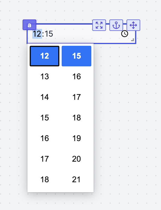
Time Input
The Time Input component allows the user to fill in a time.

The following section details Time Input component's specific settings. For more details on the App Editor, check the dedicated documentation or the App Editor Quickstart:
App Editor Documentation
The app editor is a low-code builder to create custom User Interfaces with a mix of drag-and-drop and code.
Apps Quickstart
Learn how to build your first app in a matter of minutes.
Controls
This component can be controlled by frontend scripts using these functions:
setValue
The setValue function is meant to set or force the value of a component. This can be convenient in cases where connection is not the easiest pattern. Note that it's a bad idea to mix dynamic default value and setValue together.
setValue(id: string, value: any)
Time Input configuration
| Name | Type | Connectable | Templatable | Default | Description |
|---|---|---|---|---|---|
| Min Time | string | true | false | The minimum time that can be selected. If the time provided is not valid, it will set the output "validity" to false. The format is: "HH:mm". | |
| Max Time | string | true | false | The maximum time that can be selected. If the time provided is not valid, it will set the output "validity" to false. The format is: "HH:mm". | |
| Default Value | string | true | false | The default value of the time input. | |
| 24h Format | boolean | true | false | true | Use 24h format. Will change the format of the output of the component: HH:mm to hh:mm am/pm |
Outputs
| Name | Type | Description |
|---|---|---|
| result | string | The date input value. |
| validity | boolean | Whether the time is valid. |